Projects
Tree
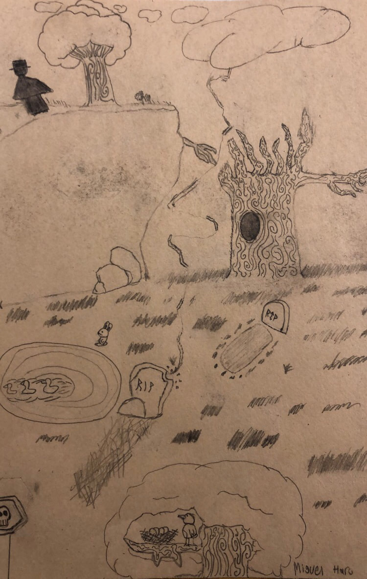
Dark and windy landscape because I like Erie things that make me feel uneasy.
Animal
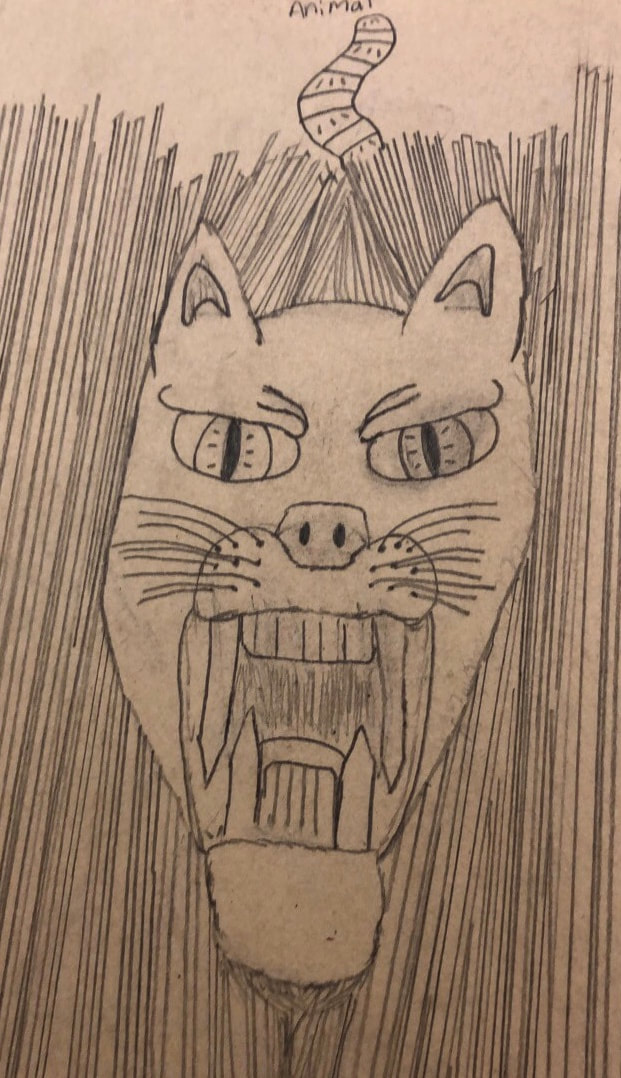
.She hides and wait...patiently...hungry, ready to feed her cubs.
1point view
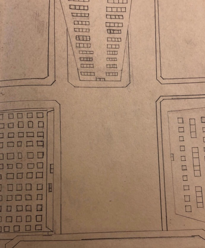
looking down on everyone, too high up to know what’s going on with everyone else.
Hand
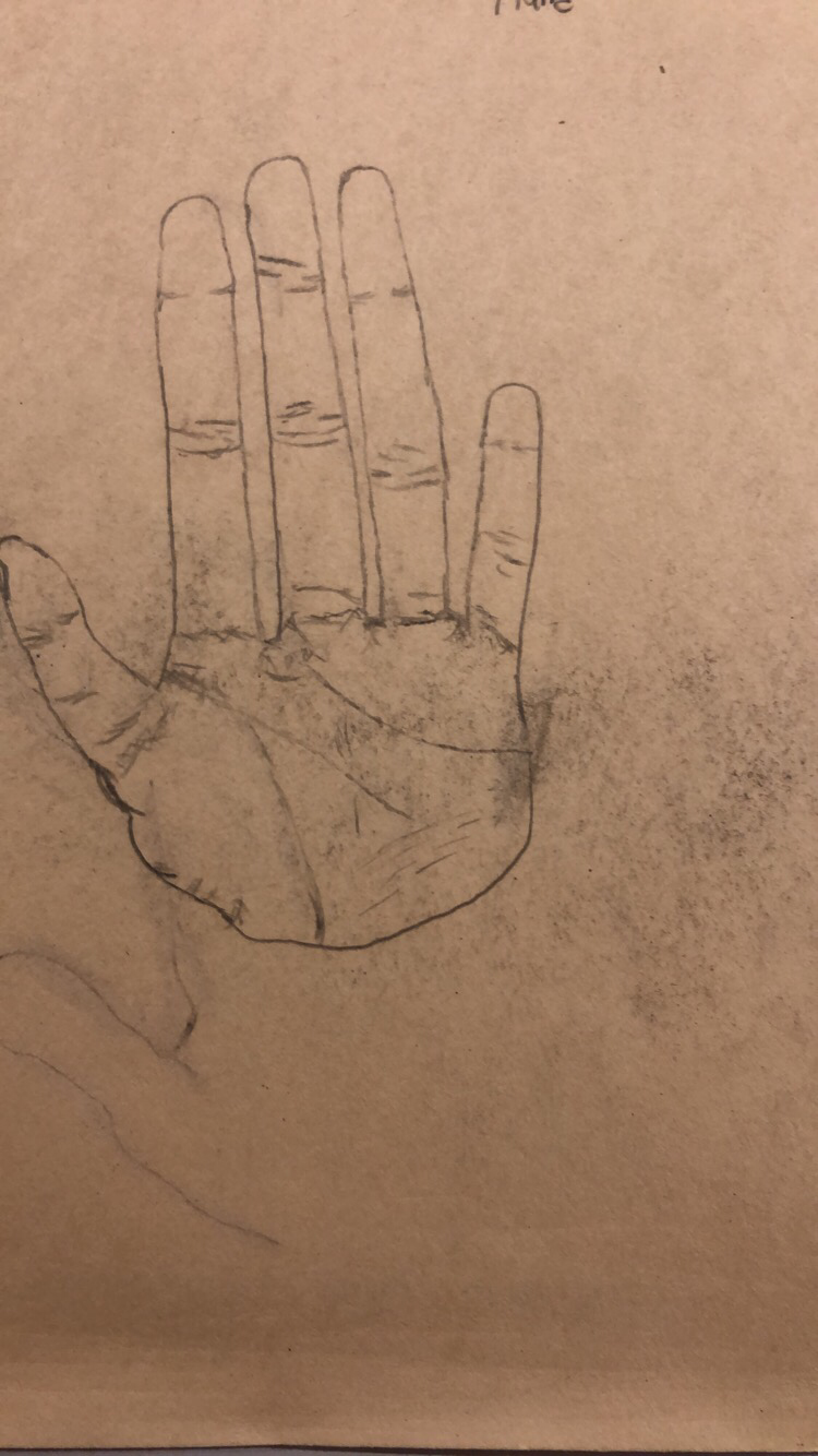
Used for clocking, cleaning, lifting, pushing, pulling, holding, and letting go.
Sphere
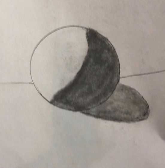
Too dark, casts a shadow, or reflection?
cylinder
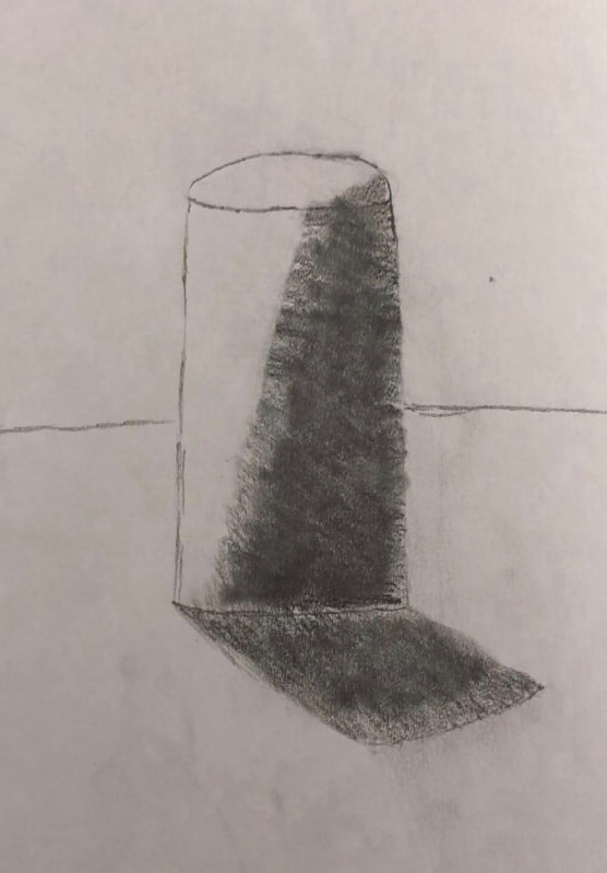
the dark side of a Pringles can...... when it’s empty.
Perspective sketch
kind of towards the left and looking from a slant, it looks how it was, i promise.
colorful perspective sketch
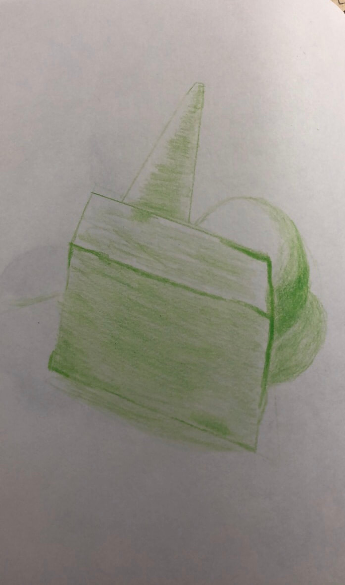
Chose green because it’s my favorite color so why not sketch with it?
practice sketches
Forgot about no negative spaces, sorry, i zone out sometimes, but dont leave any negative spaces.
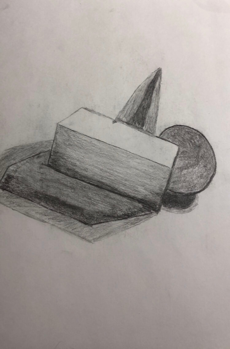
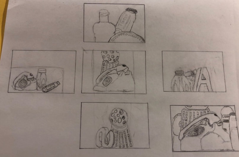
Still life: ampositional sketches
1st picture
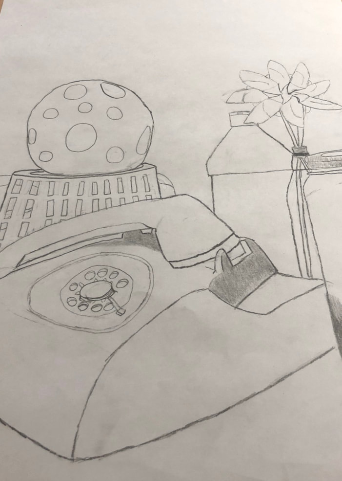
Still life: in progress
More evaluation for the still life.
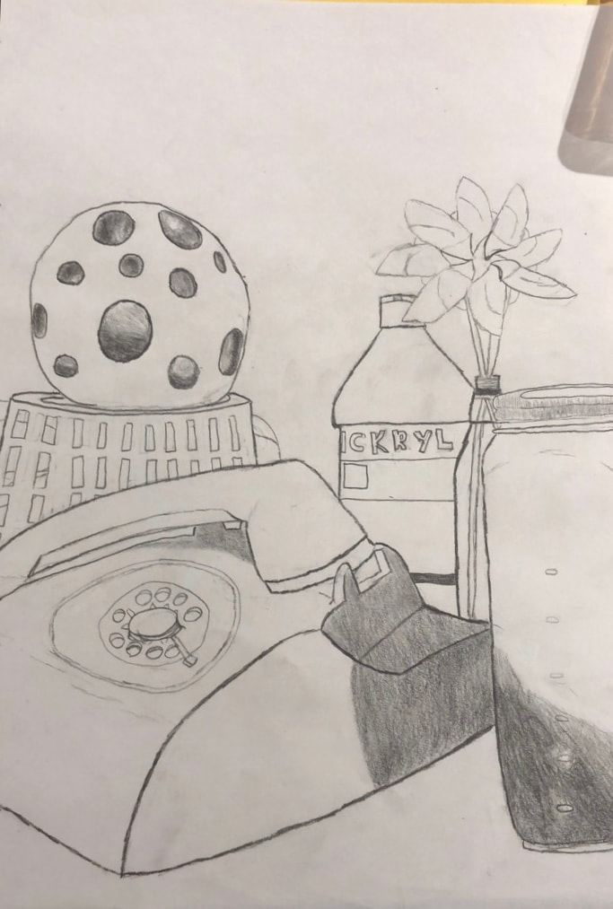
Still life: Final
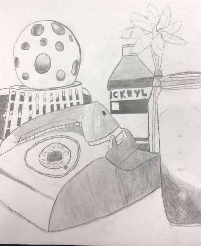
1.) I set the mason jar the closest with the phone behind it and the bottle behind the phone along with the acrylic paint and basket, I tried to make them stand out by shading and holding the edges to make them pop a little more.
2.) I used 5, I didn’t use all of the range values, I used it for the mason jar, phone, ball, the S, and the acrylic paint to make it know what’s dark and what’s getting hit by the light.
3.) I made some things that were shaded darker then others so you can tell what’s darker, closer, etc...
4.) The outside border of the objects were bolded and shaded in with pressure and some of the shading that’s lighter with not a lot of pressure was the top of the phone and in the mason jar as it gets higher.
5.) I spaced out the objects a little so you could see everything and made the still life vertical so you can see everything better, the shading is pretty close to how the model looked, I didn’t add more value, though I should have.
6.) Finish it on time and add more value and be more patient with the drawing instead of trying to rush it and end up making it sloppy.
Pen ink texture cylinder
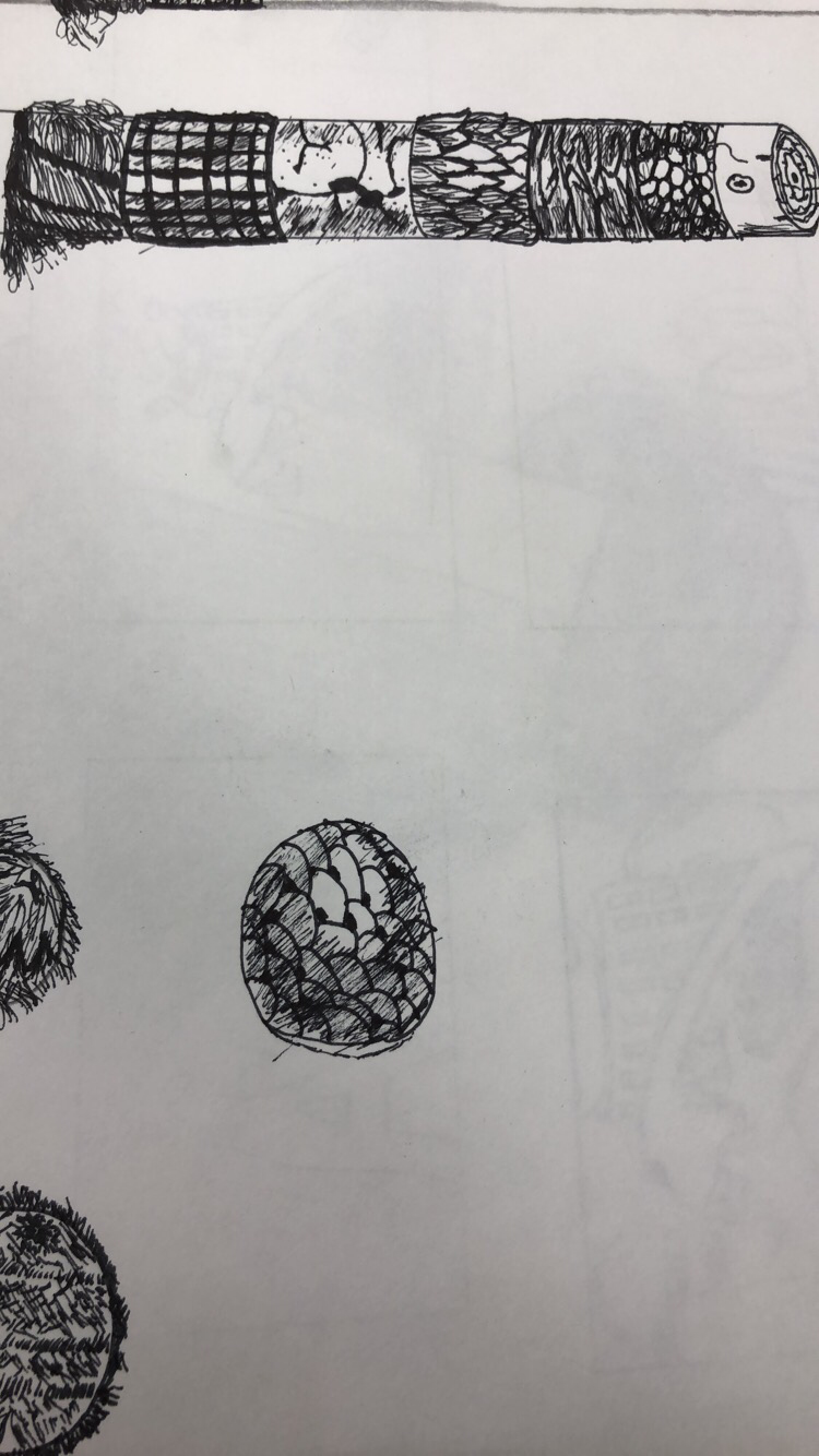
the video we watched showed us different patterns/textures where we split up a cylinder and made different sections for each pet of the cylinder
Value chart?
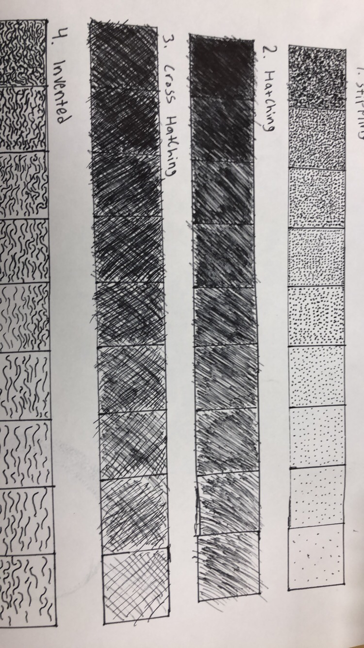
A chart that shows dark shades to a light shade, more features, they call it, value?
stippling shapes
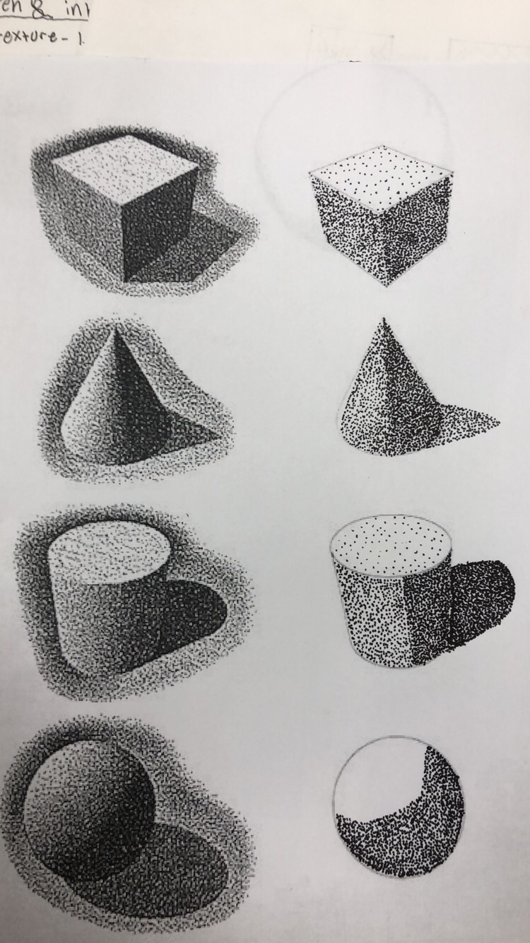
stippling is a pattern where yourepeatedly tap dots to fill out a shape or shade it to add texture and detail.
stippling is a pattern where you tap dots repedatlly to darken an object or add texture.
pen and ink strokes
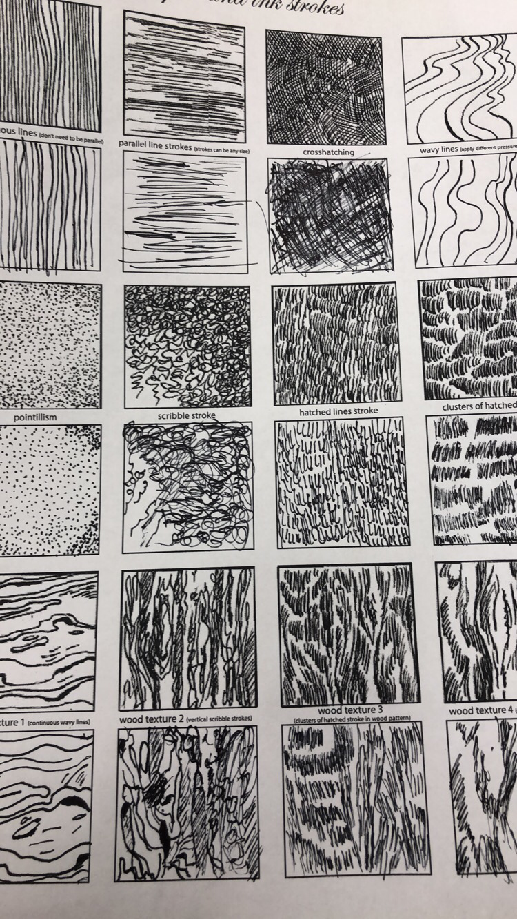
the pen and ink strokes are different patterns and shapes out in a chart for examples of different designs
pen and ink strokes part 2
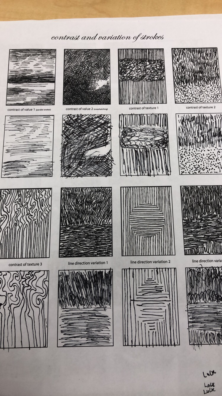
this is the 2nd part of the pen and ink patterns
Landscape
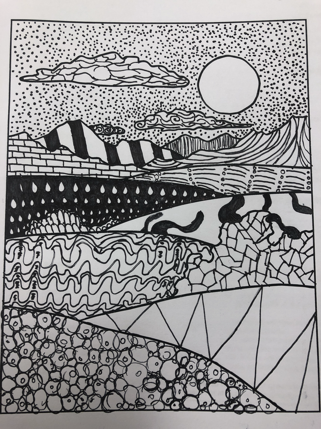
the landscape with different patterns leading up to the 2nd one
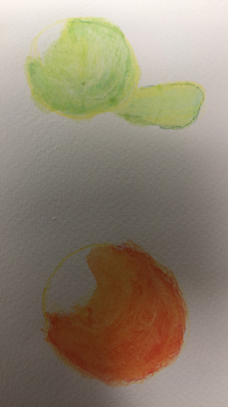
prisma color pencils
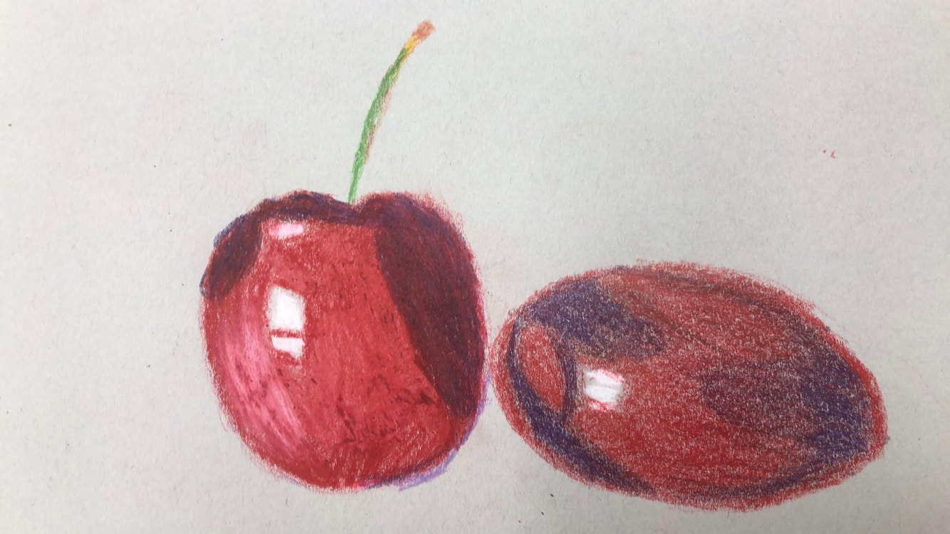
I chose the cherries and I don’t really like this one, I don’t like using the prisma colors because I’m not good at shading and blending.
pastel prisma
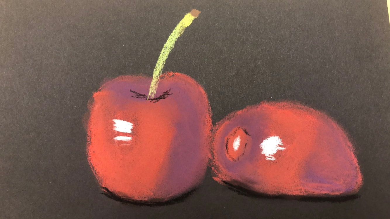
i liked using the pastels a lot more then the prisma colors because of the shading and brushing and it made it so much smoother and easier.
water color practice
not my fravorite method, I’m not good with water color, I’ve always had difficulty with it butthats because I’m not good at it.o